ED BUYS HOUSES
In this project, I was tasked with creating a typography piece that matches with the lyrics of a song. I chose the song Ed Buys Houses by Sidney Gish because the upbeat vocals and the dynamic melody were ripe for animation. I animated the text on screen one word at a time to match the artist’s delivery of her lyrics. See some of the principles used below.
TEXT AS A BLOCK

Something I learned quickly in the animation process was to animate a shape layer first. Then I would parent a pre-comp with the text to that shape layer. The text cuts to the next word where there is the most movement, to hide the cut.
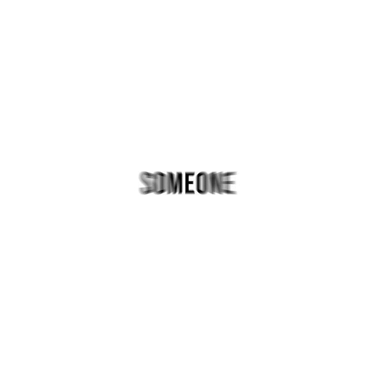
SQUASH AND STRETCH

I was told going into this project not to stretch the typography, because it would look tacky. I did not obey, but I did listen. Longer words will more often be a squash in this animation, while shorter words will more often be a stretch, that way I wouldn’t have to distort the type too much.